Media Language and Representation
I am completing this post to gain a wider understanding of how magazines use media elements and how they create meaning and construct representations that appeal to their audience. I want to find out how the layout, typography, use of language and the use of images all work together to create an enticing front cover.
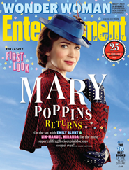 LAYOUT- The layout of Entertainment Weekly's magazine cover has the Masthead in the same place as all the other magazines sold by the same institution. They have the main image of Mary Poppins covering the masthead slightly which they do in a lot of their previous magazines, this makes it recognisable for the reader as its a well known masthead. They have put a saying "25 things you need to see, read and hear this summer, page33" they have placed this under the masthead so it is read and associated with only this magazine and it is placed on the right hand side of Mary Poppins face because you're most likely to read from left to right so once they see the very recognisable face they will then see the exclusive sticker. Also the Title is placed in the centre of the magazine underneath her face because the main story in a magazine will usually always be central.
TYPOGRAPHY- The main title is white, this is because it shows up clearly and is aesthetically pleasing for the reader, it also links to the clouds in the background as Mary Poppins is known for her magically flying through the sky hence the clouds and blue background. The font is serif which has connotations of elegance which also links to Mary Poppins being seen as elegant and polite. The way the main title is laid out makes it look like the letters are floating, this links to her flying which is suggested by the background being blue and having clouds. This is really effective as Mary Poppins is well known for being graceful and flying so the letters being a bit higher than other ones creates this effect.
USE OF LANGUAGE- The magazine uses words such as 'Exclusive first Look' because it makes the reader feel like they're buying the magazines for themselves to get the insider information. The institution uses words like these to entice the audience to feel like they're getting more and better information than any other magazine would provide them. Also the sticker on the right hand side says "25 things you need to see, read and hear this summer, page 33" this use of language is a command word which makes the audience feel like they have to read it other wise they will be left out by not knowing it.
USE OF IMAGES- The main image is of Mary Poppins because the main story is about the new film that came out. In this image she is turned to the side with her arms covering her stomach which could suggest she is hiding something and doesn't want to give away what happens in the film, she is also wearing her red long jacket and blue hat which is intertextuality as links to the original film where she wears a blue jacket and a red hat, this change in colour shows that the new film will be very similar but have some modern changes. Also, the masthead has a small umbrella in the 'e' which links to Mary Poppins as it is widely known that she flies using an umbrella, having this subtle sign in the masthead will make the customers who read Entertainment Weekly will know this issue will be mainly about Mary Poppins.
 LAYOUT- In this front cover of The Big Issue there is the main image with a red and gold christmas inspired boarder around it which links to a christmas card. Also all the text is at the bottom of the cover but central, they have done this because the main story will always be in the middle of the cover and also they are covering up unimportant parts of the main image so that the reader can focus on their faces.They have also placed a star sticker above Meghan's head which has the new price on it because it is more expensive in the holidays. Also it is placed above Meghan's head because it is saying she is at the top of the tree.
TYPOGRAPHY- Meghan's name is in glitter because it shows royalty and makes her stand out as she is the celebrity endorsement. All the typography is sans serif which shows it is less formal than other magazines. This has a sense of fun behind it which shows the institution are trying to show the Grenfell survivors getting on with their lives and becoming happy again.
USE OF LANGUAGE- The institution uses words such as "exclusive-only in the big issue" because it makes the audience feel like they're getting information that is only found in this magazine. they feel like if they read this they will know more than other people do. They also use words such as "plus"which makes it look like they have extra stories and information making the audience feel like they're getting out more than they put in and are getting a bargain for their money.
USE OF IMAGES- Meghan Markle is placed of centre to the right hand side because she is under the start, the institution has done this to make it look like she is at the top of the tree showing she is better than the other people in the image and that she is more important. Also it is a head and shoulders shot of her which is a convention for entertainment magazines, also you cant see the other girls faces in the image which focuses the audience on Meghan as she is the celebrity endorsement.
In conclusion, I've found out that the institution uses media elements which appeal to their audience such as using celebrity endorsements and intertextuality. In my coursework i will take this on and follow the conventions I've found out in this task such as the use of language and the exclusive stickers. In my media coursework I will have my masthead at the top of the front cover on every issue I produce, this will stay consistent throughout because it is expected of an entertainment magazine. I will have a mid shot of my models with them central to the magazine, my titles and typography will be above and below the image to ensure that you can still see the models faces and the way they're positioned. This layout will provide the reader with information about whats inside the magazine but also draw attention to the models faces. The typography will match the red, white and black colour scheme with the exception of contrasting colours such as yellows and greens to make them stand out. I will use a combination of sans serif and serif typography, i will mainly use serif because it gives my magazine a more important and sophisticated feel to it. My language will include words such as exclusive and plus to make the reader feel like they're gaining more information out of my magazine than out of an alternate choice. I will also use language that the reader will relate to and find comedic such as some intertextuality like referencing to James Bond when it isn't actually him.
LAYOUT- The layout of Entertainment Weekly's magazine cover has the Masthead in the same place as all the other magazines sold by the same institution. They have the main image of Mary Poppins covering the masthead slightly which they do in a lot of their previous magazines, this makes it recognisable for the reader as its a well known masthead. They have put a saying "25 things you need to see, read and hear this summer, page33" they have placed this under the masthead so it is read and associated with only this magazine and it is placed on the right hand side of Mary Poppins face because you're most likely to read from left to right so once they see the very recognisable face they will then see the exclusive sticker. Also the Title is placed in the centre of the magazine underneath her face because the main story in a magazine will usually always be central.TYPOGRAPHY- The main title is white, this is because it shows up clearly and is aesthetically pleasing for the reader, it also links to the clouds in the background as Mary Poppins is known for her magically flying through the sky hence the clouds and blue background. The font is serif which has connotations of elegance which also links to Mary Poppins being seen as elegant and polite. The way the main title is laid out makes it look like the letters are floating, this links to her flying which is suggested by the background being blue and having clouds. This is really effective as Mary Poppins is well known for being graceful and flying so the letters being a bit higher than other ones creates this effect.
USE OF LANGUAGE- The magazine uses words such as 'Exclusive first Look' because it makes the reader feel like they're buying the magazines for themselves to get the insider information. The institution uses words like these to entice the audience to feel like they're getting more and better information than any other magazine would provide them. Also the sticker on the right hand side says "25 things you need to see, read and hear this summer, page 33" this use of language is a command word which makes the audience feel like they have to read it other wise they will be left out by not knowing it.
USE OF IMAGES- The main image is of Mary Poppins because the main story is about the new film that came out. In this image she is turned to the side with her arms covering her stomach which could suggest she is hiding something and doesn't want to give away what happens in the film, she is also wearing her red long jacket and blue hat which is intertextuality as links to the original film where she wears a blue jacket and a red hat, this change in colour shows that the new film will be very similar but have some modern changes. Also, the masthead has a small umbrella in the 'e' which links to Mary Poppins as it is widely known that she flies using an umbrella, having this subtle sign in the masthead will make the customers who read Entertainment Weekly will know this issue will be mainly about Mary Poppins.
LAYOUT- In this front cover of The Big Issue there is the main image with a red and gold christmas inspired boarder around it which links to a christmas card. Also all the text is at the bottom of the cover but central, they have done this because the main story will always be in the middle of the cover and also they are covering up unimportant parts of the main image so that the reader can focus on their faces.They have also placed a star sticker above Meghan's head which has the new price on it because it is more expensive in the holidays. Also it is placed above Meghan's head because it is saying she is at the top of the tree.TYPOGRAPHY- Meghan's name is in glitter because it shows royalty and makes her stand out as she is the celebrity endorsement. All the typography is sans serif which shows it is less formal than other magazines. This has a sense of fun behind it which shows the institution are trying to show the Grenfell survivors getting on with their lives and becoming happy again.
USE OF LANGUAGE- The institution uses words such as "exclusive-only in the big issue" because it makes the audience feel like they're getting information that is only found in this magazine. they feel like if they read this they will know more than other people do. They also use words such as "plus"which makes it look like they have extra stories and information making the audience feel like they're getting out more than they put in and are getting a bargain for their money.
USE OF IMAGES- Meghan Markle is placed of centre to the right hand side because she is under the start, the institution has done this to make it look like she is at the top of the tree showing she is better than the other people in the image and that she is more important. Also it is a head and shoulders shot of her which is a convention for entertainment magazines, also you cant see the other girls faces in the image which focuses the audience on Meghan as she is the celebrity endorsement.
In conclusion, I've found out that the institution uses media elements which appeal to their audience such as using celebrity endorsements and intertextuality. In my coursework i will take this on and follow the conventions I've found out in this task such as the use of language and the exclusive stickers. In my media coursework I will have my masthead at the top of the front cover on every issue I produce, this will stay consistent throughout because it is expected of an entertainment magazine. I will have a mid shot of my models with them central to the magazine, my titles and typography will be above and below the image to ensure that you can still see the models faces and the way they're positioned. This layout will provide the reader with information about whats inside the magazine but also draw attention to the models faces. The typography will match the red, white and black colour scheme with the exception of contrasting colours such as yellows and greens to make them stand out. I will use a combination of sans serif and serif typography, i will mainly use serif because it gives my magazine a more important and sophisticated feel to it. My language will include words such as exclusive and plus to make the reader feel like they're gaining more information out of my magazine than out of an alternate choice. I will also use language that the reader will relate to and find comedic such as some intertextuality like referencing to James Bond when it isn't actually him.

S – Good analysis of chosen texts.
ReplyDeleteI – You need to include examples of how you specifically intend to use the information you summarised in your production… what specifically do you intend to use in production that links to this research? What media language and representations do you intend to use in your productions? Be specific.
T – Please write the above in RED FONT as part of your conclusion.